Team Management · Product & Design Direction · UI/UX Design · Prototyping
For the past few releases, my team has been working on upgrades to Airbnb's core product and services. We continued that focus with this launch, making major improvements to three of the most used guest features: Rooms, Wishlists, and Monthly Stays.
Airbnb Rooms: Host PassportWishlistsMonthly Stays
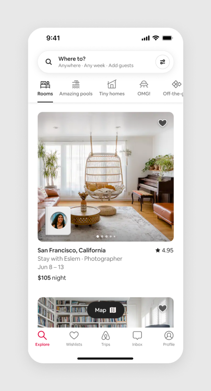
Rooms
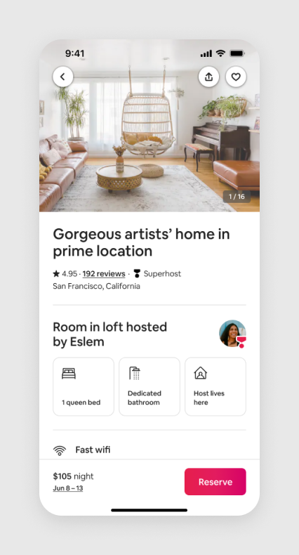
At the core of Airbnb is the idea of hosting, and more specifically, staying with a host in their home. Getting to know your host, the stories they share, and local recommendations they provide can be an exciting part of staying in an Airbnb.
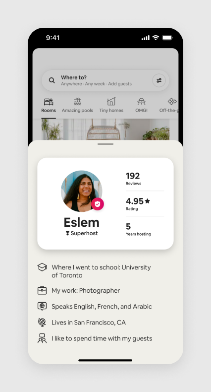
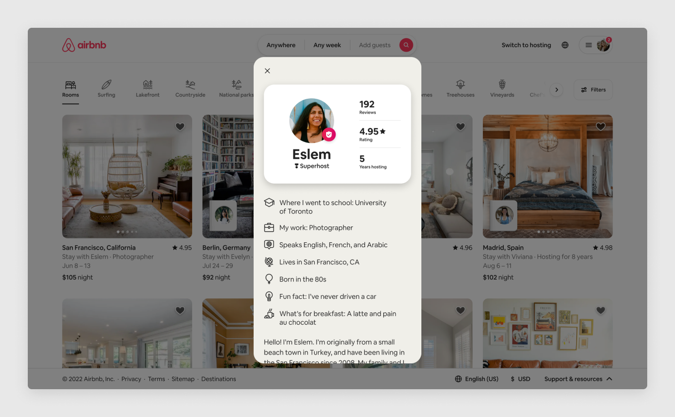
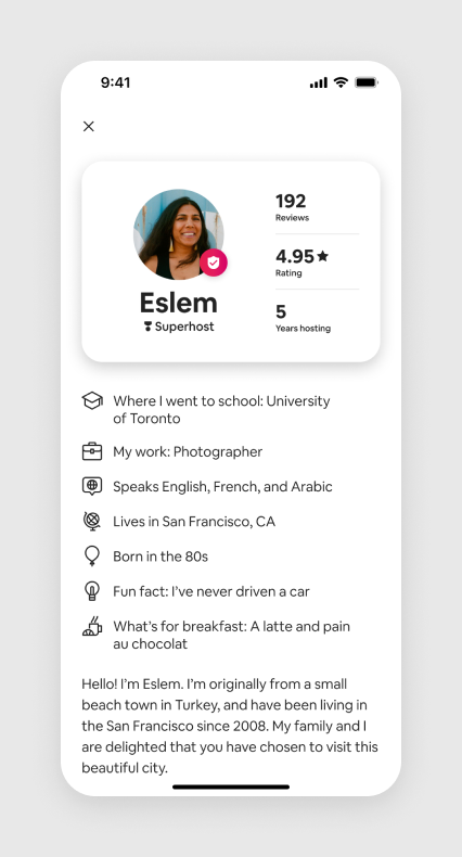
We started by elevating the host with a little booklet on top of the listing card. Tapping on that booklet animates into the Host Passport, a small preview of the host’s profile that shows off their personality and why they love hosting. These touches bring more connection between the host and potential guests and breaks down the barriers between strangers.
We also know that staying in someone else’s home can feel a little uncomfortable at first. So we brought forward the safety and privacy aspects of private rooms to help ease the minds of first-time guests.
Rooms listing card A little introduction to the hostHost Passport Get to know the host with fun promptsPrivacy features Know more about the space before you arriveThe Rooms category on desktop
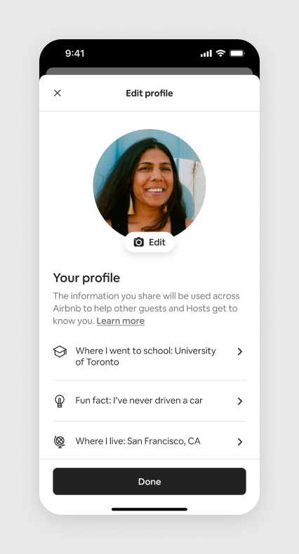
Profile customization
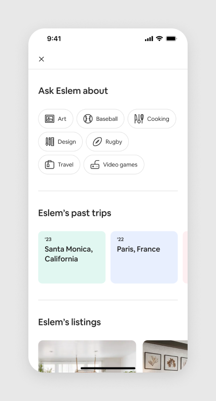
With our renewed focus on the host, and the addition of the new fields for the Host Passport, which we called "prompts", we needed to upgrade the profile and profile edit experience. We streamlined the flow to make it quick and easy so more hosts would have a completed and personalized profile.
Profile display Redesigned to focus on what makes the host specialProfile display, scrolled Redesigned to focus on personality and travelProfile edit Quick access to all prompts and options
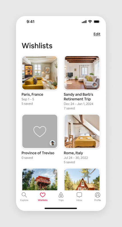
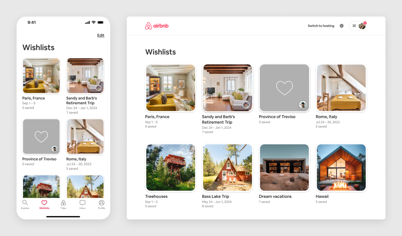
Wishlists
Many guests use Wishlists to narrow down their selection before choosing the one home they book. However, that's not an easy job. The guest needed to jump between different listings, comparing availability and amenities, and maybe forget why they saved that home in the first place. Our focus for this launch was to introduce features that help guests know which stays are available, make it easier to compare, and make that final decision.
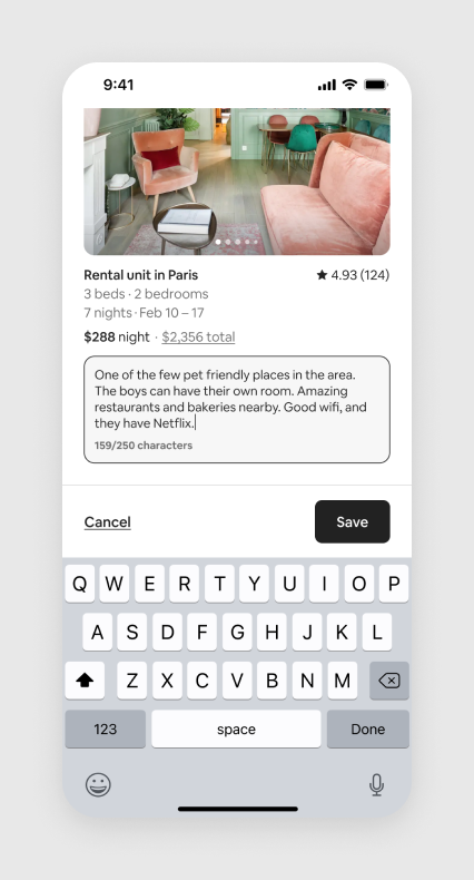
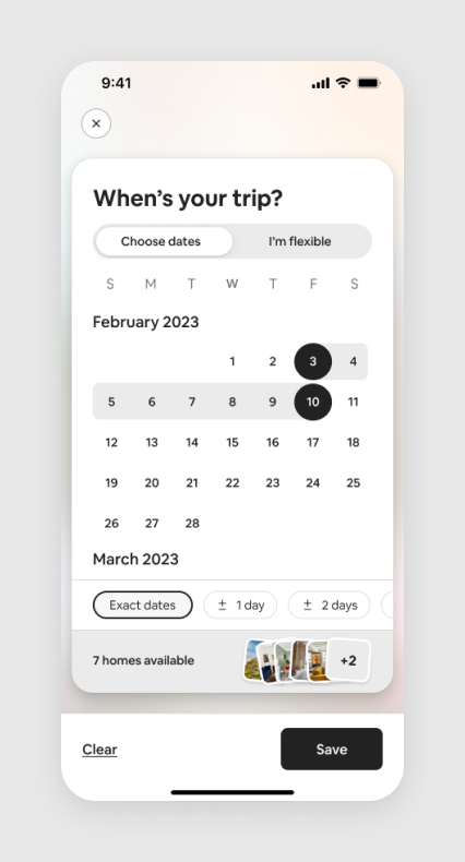
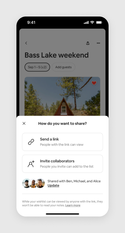
We introduced notes to give guests a quick way to remember the key reasons they love each home. We added availability information within the calendar so guests who have flexible dates can quickly see which homes are available at once. Finally, we improved the saving and sharing experiences to allow everyone traveling have a say in where they stay.
Add a note Guests can add custom notes to each saved homeAvailability row Calendar shows which homes are available for the selected datesSharing Full control over who can view and contribute
Visual upgrades
It had also been a few years since we had revisited the visual design of the wishlists. We made a few minor upgrades to bring it inline and consistent with the rest of the guest experience.
Wishlist tab on iPhone and desktop Updated layout focused on your saved homes
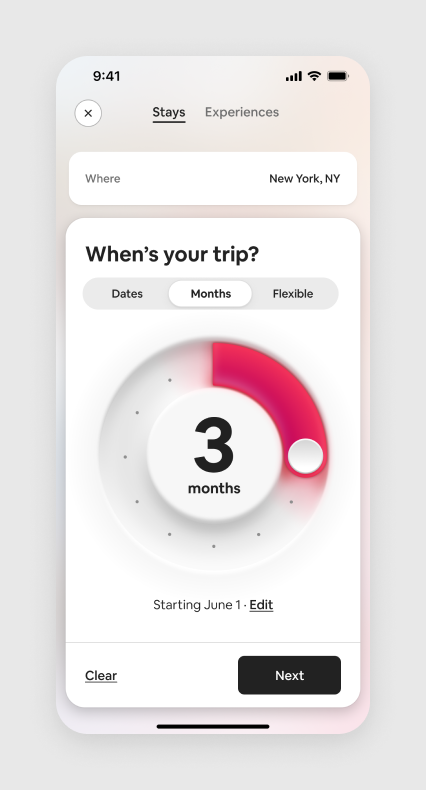
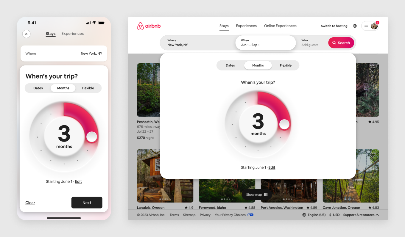
Monthly Stays
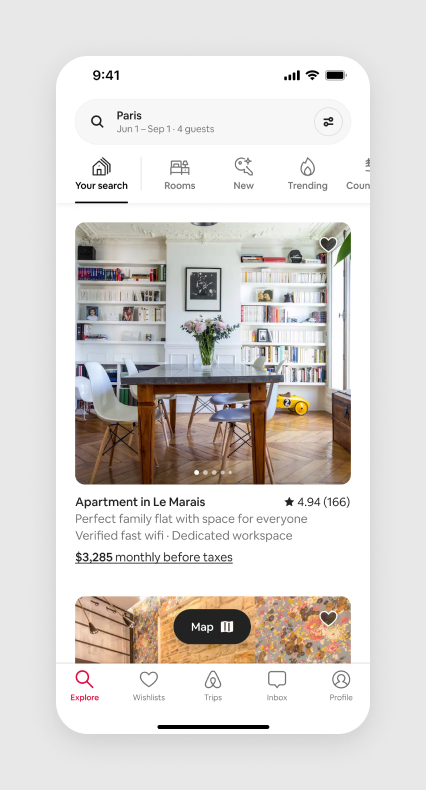
Guests staying for multiple months in an Airbnb continues to be a growing audience. Whether you're relocating to a new city for work or just need a new change of scenery, there's no better way to stay for long periods of time than in an Airbnb.
To help these guests book their stay, along with making it easier and cheaper to pay in monthly installments, we introduced the Monthly Stays dial. Instead of needing to tap through a few pages of a calendar, guests can now simply select their check-in date and rotate the dial to select the duration of their stay.
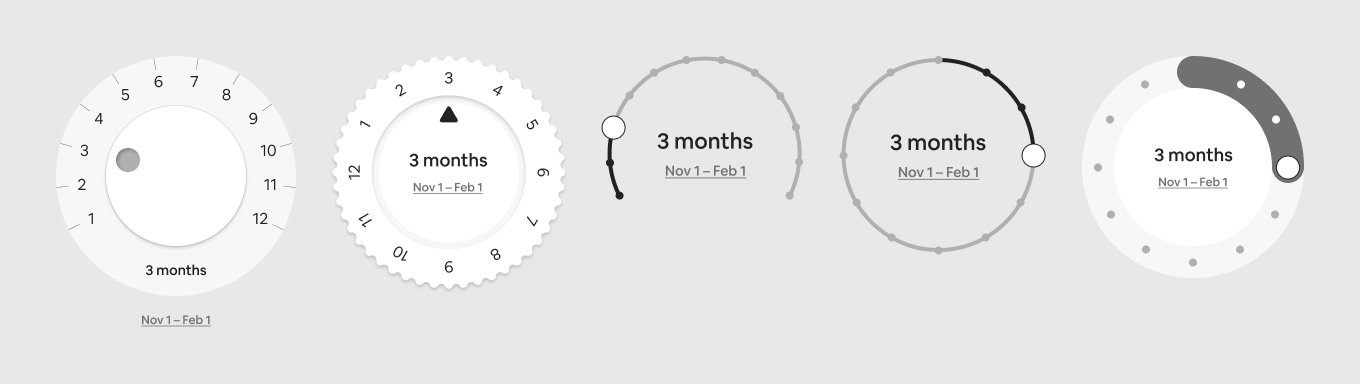
We started by iterating on a bunch of options for the dial, ranging from simple and standard styles to something more skeuomorphic and tactical.
Sample of iterations on the dial style Credit: Hongru Hou
Dial design
After a bunch of iterations, prototypes, and testing, we landed on a dial with a slick 3D style, complete with a dynamic glow effect and haptic feedback. We wanted to make this feel like a more branded experience rather than just another common control.
Monthly Stays dial A simple, fun way to select your stay duration
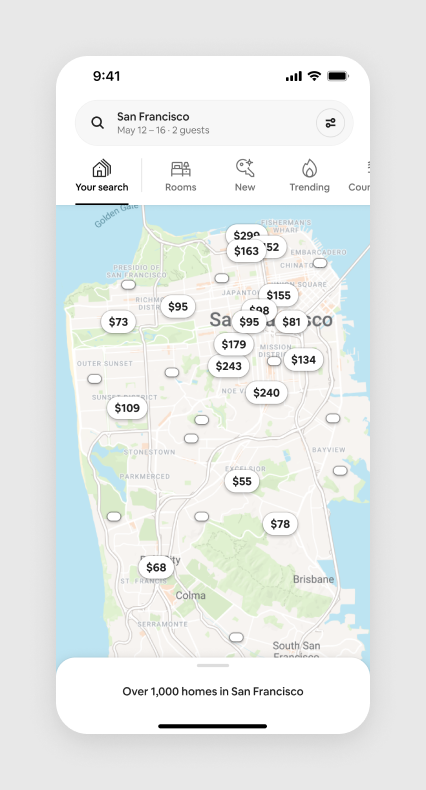
Search and Maps
Along with major new features, we continued to add smaller improvements to our standard search and map experience.
Previously, we used to only show 16 results on the map. Guests were confused, thinking those were the only homes available. We introduced Mini Pins to show more listings across a wider area, but still keep the focus on the most relevant homes.
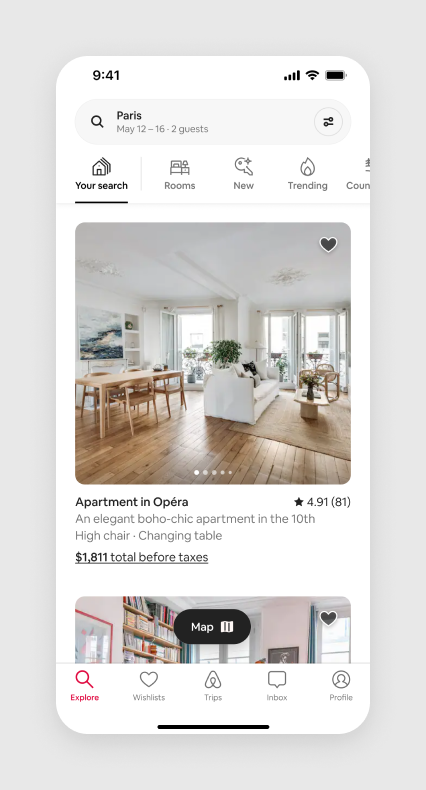
We also brought over highlights from categories into our search results. Now, if you’re traveling with children or infants for example, we highlight family-friendly amenities such as cribs, changing tables, or game consoles.
Mini pinsHighlights for traveling with childrenHighlights for long terms stays